A coaster is a small canvas with unforgiving rules. It is round or square, usually no wider than four inches, and it gets die-cut, so anything important that drifts too close to the edge gets sliced off. Most reprints and disappointing proofs trace back not to the design itself but to a file that was built without the print process in mind: art at screen resolution, colors in the wrong mode, no bleed, a logo crowding the cut line. Getting those mechanics right the first time is what separates a clean, on-brand coaster from a muddy one with a shaved-off tagline. This walkthrough covers the specs that matter, in the order you actually make the decisions.
Start with size and shape
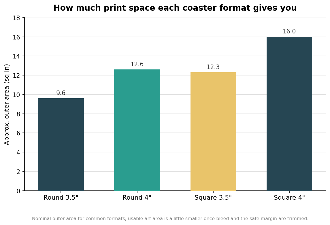
The two most common coaster footprints are 3.5 inches and 4 inches, offered in both round and square. Round 3.5-inch (roughly 90 mm) is the classic bar coaster; the 4-inch square gives you the most surface to work with, which matters if your design has a lot to say. Shape is not just cosmetic. A square puts usable area in the corners that a round simply does not have, so the same logo effectively prints larger on a square of the same nominal size. Custom die-cut shapes, cut to the silhouette of a bottle or a badge, are available from most printers but add a cutting die and cost, and they shrink your safe printing area further because the cut path is more complex. Decide size and shape before you draw anything, because every later spec, bleed included, is measured from that edge.
Thickness is a spec, not a guess
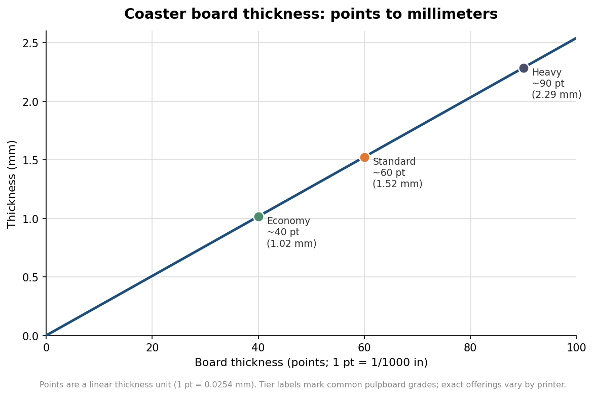
Coaster board is measured in points, where one point equals one thousandth of an inch, so a 60-point coaster is 0.06 inches, or about 1.5 mm, thick. Economy pulpboard tends to land around 35 to 40 points, standard bar coasters commonly run about 60 points, and heavy premium stock climbs toward 90 points and beyond. Thickness does two things at once. It signals quality in the hand, a flimsy coaster reads as cheap, and on absorbent pulpboard it correlates loosely with how much condensation the coaster can soak up before it saturates. If your coaster’s job is to protect a bar top through a full pint’s worth of sweat, heavier absorbent board earns its slightly higher price. If it is a one-night promotional handout, lighter stock is a reasonable economy. State the point weight on your order rather than leaving it to assumption, because “standard” means different things at different printers.
Build a print-ready file
Four file rules cover most of what goes wrong. Work in CMYK, not RGB, because presses print in cyan, magenta, yellow, and black, and a vivid RGB blue or green that looks great on screen can shift noticeably once it is converted for print. Set raster art to 300 dpi at final size; a logo pulled from a website is usually 72 dpi and will look soft when it is blown up to coaster scale. Add bleed, meaning you extend any background color or image past the trim edge so that a slight shift during cutting never leaves a white sliver. A common requirement is a quarter inch of bleed past the edge, though some printers ask for an eighth inch, so confirm the number with yours. Keep text and logos inside a safe margin, often around three-sixteenths of an inch inside the cut line, so nothing critical rides the edge. Beyond those four, supply vector files where possible, with EPS or print-ready PDF the preferred formats, convert fonts to outlines or include the font files, and embed any placed images so nothing goes missing when the printer opens the file.
The choices that change your quote
A few remaining decisions move the price and the timeline more than buyers expect. The biggest is one side versus two: printing the back of a coaster is effectively a second print job and is priced that way, so if the back only needs a small handle or hashtag, decide whether the extra cost is worth it. Surface treatment matters too. Traditional pulpboard is uncoated so it stays absorbent, which is the point for a drink coaster; a coated or laminated finish looks glossier and resists staining but reduces absorbency, a genuine trade-off rather than a strict upgrade. Ink coverage plays in as well, since a full-bleed dark background uses more ink and can show flooding on absorbent stock, where a design with more open board prints cleaner. Finally, quantity drives the unit price hard: coasters are cheapest by the thousand, and most printers set a minimum order, so it is worth pricing a couple of quantity tiers before you commit.
A quick pre-send checklist
Before you hand off artwork, run a short mental pass. Confirm the document is built at the exact coaster size with bleed added and the safe margin respected, that the color mode is CMYK, and that raster elements sit at 300 dpi. Check that fonts are outlined or supplied and that images are embedded. Note the point weight, the shape, whether it is one or two sides, and the coating on the order itself rather than in a separate email that can get lost. Ask for a proof and read it against these specs, not just for typos, since the proof is the last cheap moment to catch a problem. Coasters are inexpensive per piece, which is exactly why a mistake stings, a small error multiplies across a large run. Spend the extra ten minutes on the file, and the print takes care of itself.